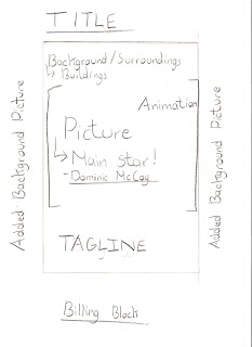
Here is our first example for our film poster layout. In this layout the main image which will be framed in the center of the page shall be split between animation editing and a real life close up shot of the main star featured in our short film. A tagline is also added to give the message or more information to the viewer.
The idea of having the poster split between animation ands real life pictures is to make the poster more interesting and entertaining to the viewer's eyes giving a mix of reality and animation.
Here is our second example for our Film Poster layout. The main focus shall be the close up of a knife which will be cropped and framed in the center bringing the attention of the viewer to the idea of what our short film is based on. This can also be seen as a semiotic in which we recognise the close up of the knife. Other semiotics will include the title of the short film, the tagline and the graphics edited on the poster.
A Billing Block is also added to show the names of the Director, casting, and production team. This will add more detail of the short film featuring everyone who was involved in the making of our film.
Here is our third example of our film poster layout. As with other film posters our poster features a main image of the main star of our main character which will be shown as a close up of his face. The tagline is also added to give the viewer more information and basic idea of the theme of the film. It also features a release date and the background of the picture shall be filled with surrounding images which can be seen within our short film.


No comments:
Post a Comment